
The Strategy Builder and the Payoff Diagram
Before any strategy, you need to read a payoff diagram. Learn what the curve shows, the orange at-expiry line versus the blue T+0 line, the sigma bands, and how OpenAlgo's strategy builder draws it from your legs on real NIFTY data.
- ·What a payoff diagram shows
- ·The at-expiry vs the T+0 curve
- ·Profit and loss zones
- ·Legs: the pieces of a strategy
- ·The sigma bands and spot line
- ·Reading a real example
Picture a single chart that answers the only question that matters before you risk a rupee. If NIFTY finishes higher up here, or flat in the middle, or far lower at the bottom, what do you actually make or lose? That one chart is the payoff diagram, and learning to read it is the real skill behind every named strategy in this course. A strategy is nothing more than a set of option legs stacked together, and its payoff diagram is the honest portrait of how that stack behaves. Master the picture and the fancy names stop mattering. You will look at any combination and say, in seconds, where it earns, where it bleeds, and how much is on the line. The OpenAlgo strategy builder draws this picture for you, and every chart in this course comes straight from it, built on real NIFTY option prices captured on 26 June 2026.
A payoff diagram is a picture of your money
Every payoff chart in this course shares the same two axes, so once you read one you can read them all.
- The horizontal axis is the price of NIFTY at expiry. NIFTY is the index, the natural home of these strategies, because its options are the most liquid in the country. On 26 June 2026 the index sat at a spot of 24,056, with the at-the-money strike at 24,050. Every chart is drawn for the 28 July 2026 monthly expiry, the NSE monthly that falls on a Tuesday about 32 days out. As your eye travels left NIFTY has fallen, and as it travels right NIFTY has risen.
- The vertical axis is your profit or loss on the whole position, in rupees for one lot of 65. Above the zero line you are in profit, below it you are in loss.
The single most important feature is the zero line, the level where profit and loss is exactly nothing. Wherever the strategy sits above it you are making money, and wherever it sits below it you are losing. The whole game is reading where the line lives at each possible closing price.
A payoff diagram plots your profit or loss (vertical) against the price of NIFTY at expiry (horizontal), in rupees for one lot of 65. Above the zero line is profit, below it is loss. Read where the line sits and you know your outcome at any price.
The two lines: at expiry and today
Look closely at any builder chart and you will see two lines, not one. They tell different stories and you need both.
- The orange "At Expiry" line is the value of your position on the final day, 28 July 2026, when all time value has drained away and only intrinsic value remains. This is the clean, kinked shape most people mean by payoff. It is what you keep or owe if you hold to the last bell.
- The blue dashed "T+0" line is the value of your position today, right now, with zero days passed, which is what T+0 means. It is smoother and rounder because the options still carry time value.
The two differ because of time. An option is worth more before expiry than at expiry for the same price of NIFTY, since there is still time for the index to move your way. That extra worth is time value, and it melts away as expiry nears. By the final day the blue today line has collapsed onto the orange expiry line. So the blue dashed line is roughly what your screen shows now, and the orange line shows where you are heading if nothing is closed early.
The orange At Expiry line is your destination. The blue dashed T+0 line is where you stand today. As the days pass, the blue line slides toward the orange one, because the time value baked into every option decays to zero by expiry.
Profit zones, loss zones, and the breakeven
Once you find the zero line, the chart splits into two shaded regions.
- The profit zone is every closing price where the orange expiry line sits above zero. The builder shades this green.
- The loss zone is every closing price where the orange line sits below zero, shaded red.
The exact price where the orange line crosses zero is a breakeven, the close at which you neither make nor lose. Some strategies have one breakeven, many have two, a few have four. The builder drops an amber breakeven dot on each crossing so your eye lands on it. Everything on one side of that dot is profit, everything on the other is loss, so the breakeven is the boundary fence between the green and the red.
Two flat landmarks finish this view. The maximum profit is the highest the orange line ever reaches, and the maximum loss is the lowest it ever sinks. For a defined-risk strategy both are flat, finite shelves, so you know your best and worst case before you ever place the order.
The sigma bands and the spot line
Two more features on every builder chart tell you what the market itself expects.
- A bright pink vertical line marks the current spot at 24,056, so you can see at a glance how far each breakeven sits from where NIFTY trades today.
- Behind the payoff sit faint shaded sigma bands, also called standard deviation bands. The inner pair marks a one standard deviation move and the outer pair a two standard deviation move, measured from the at-the-money implied volatility of about 12.7 percent and the days left to expiry. In plain words, they show the range the option market is pricing in. NIFTY is expected to finish inside the inner band about two times in three, and inside the outer band almost always.
Those bands are a reality check. If a strategy only profits when NIFTY lands far outside the outer band, the market is telling you that outcome is unlikely. If its profit zone comfortably covers the inner band, the odds are friendlier. You are reading the trade against the move the market actually expects, not against wishful thinking.
Before judging any strategy, glance at where its green profit zone sits against the faint sigma bands. A profit zone that covers the inner one standard deviation band is betting on a likely outcome. One that needs NIFTY beyond the outer band is betting on a rare one. The bands turn a guess into an informed read.
Legs: the pieces you stack
A leg is one single option in your position. You already know the four legs from Options Basics, the four atoms every strategy is built from.
- Buy a call, the right to buy, for when you expect a rise.
- Sell a call, the obligation to pay the buyer's gain if assigned, for when you expect NIFTY to stay below a level.
- Buy a put, the right to sell, for when you expect a fall.
- Sell a put, the obligation to pay the buyer's gain if assigned, for when you expect NIFTY to stay above a level.
For NIFTY index options, assignment is cash-settled: at expiry the seller simply pays the option's intrinsic value, with no shares changing hands. (Single-stock options can instead settle by physical delivery, which is one more reason traders usually close a position before expiry rather than carry it into settlement.)
A strategy is simply two or more legs held at once, on the same underlying and expiry, chosen so their combined payoff has a shape you want. When you sell one leg, the premium you collect helps pay for a leg you buy. That is the quiet engine behind almost every spread. One leg funds another, lowering your cost or your risk in exchange for capping your reward. The combined payoff is just the sum of the legs, added up rupee by rupee at every price, and that adding-up is exactly what the builder does for you.
The strategy builder draws the combined payoff of your legs from real NIFTY option prices, modelled with Black-76 off the synthetic future, the correct method for Indian options. The same engine produced every chart in this course. Spot 24,056, ATM strike 24,050, lot 65, strikes on a 50-point grid, expiry 28 July 2026.
Reading one real example end to end
Let us read a real strategy together, the bull call spread, so the whole picture clicks. It is a mildly bullish trade with two legs, both calls, on the 28 July 2026 expiry.
| Leg | Action | Strike | Type |
|---|---|---|---|
| 1 | Buy | 24,050 | Call |
| 2 | Sell | 24,150 | Call |
You buy the 24,050 call and sell the 24,150 call. The call you sell brings in premium that pays down most of the cost of the call you buy, so the position costs far less than a lone call. That net cost, the net debit of Rs 3,624, is the most you can lose. Here is what the builder reports.
| Number | Value |
|---|---|
| Breakeven | 24,106 |
| Max profit | Rs 2,876 |
| Max loss | Rs 3,624 |
Now read the chart. To the left, below 24,050, both calls expire worthless and you lose the whole net debit, Rs 3,624. That flat red floor is your maximum loss. As NIFTY climbs past 24,050 the bought call gains value and the loss shrinks, until at the breakeven of 24,106, marked by the amber dot, the orange line crosses zero into the green. Above 24,150 both calls are deep in the money, the spread is fully open, and your profit stops growing at its ceiling of Rs 2,876, a flat green roof. The blue dashed T+0 line shows the same journey rounded off, because time value is still present today and will be gone by 28 July. Notice that the breakeven of 24,106 sits just inside the inner sigma band, so this trade is betting on a modest, believable rise, not a moonshot.
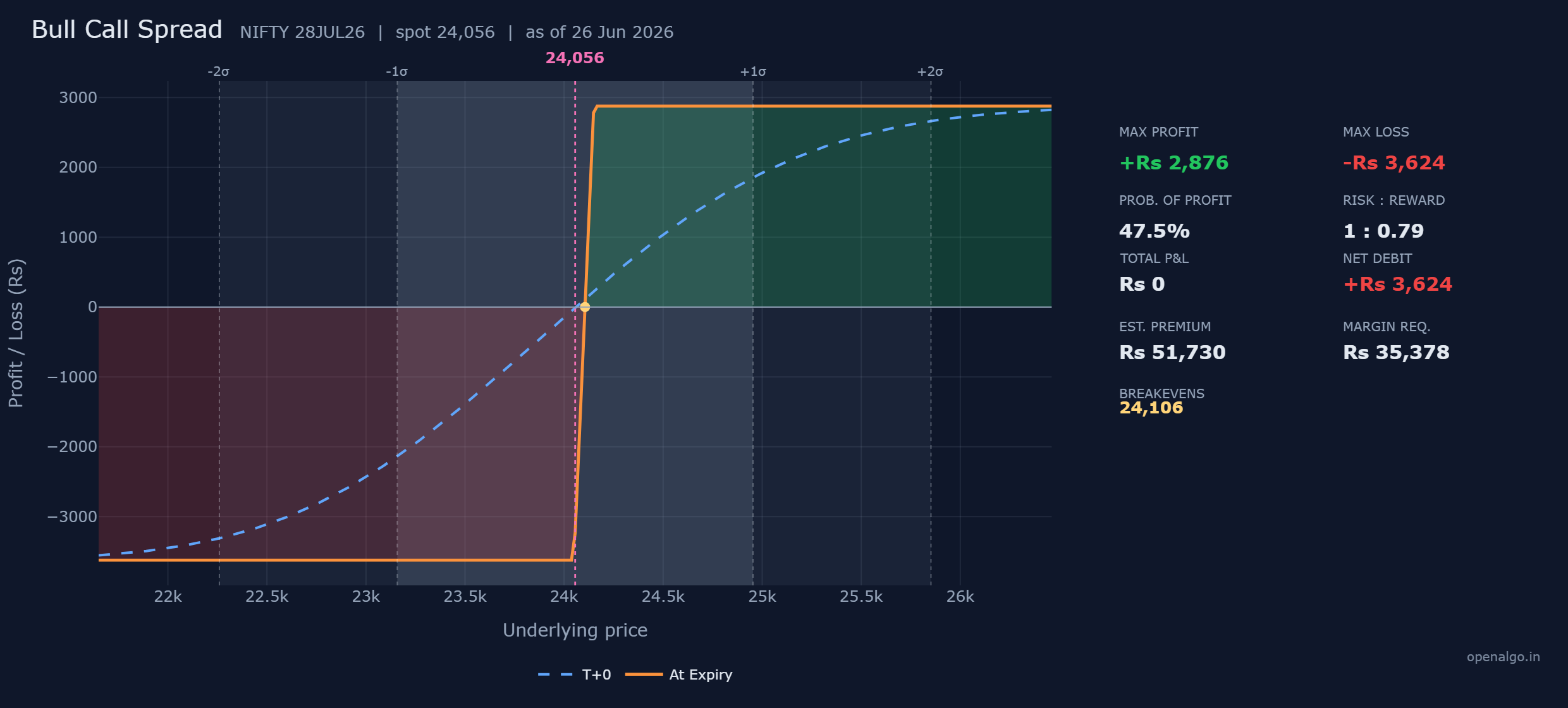
That is the entire method. Find the zero line, the amber breakeven dots, the green and red zones, the two flat ceilings, the pink spot line, and the faint sigma bands. Do that on any chart and you have read the strategy. Every chart in OpenAlgo wears the same clean openalgo.in look, so the skill transfers to every payoff you will ever build. Before you risk real money you can also rehearse the order mechanics with sandbox trading (analyzer mode in OpenAlgo), so nothing feels strange when real capital is involved. In the next chapter we slow down and study the full panel of nine numbers that sits beside every one of these charts.